What they wanted
Yumi Sweets founder Nicole Wilkie approached KidDotCo to help her with her brand her startup company. Her mission was to create a range of Nut-free and gluten-free products to sell locally. She was looking for something eye-catching but very simplistic… this was certainly right up our street!
What we did
- Brand Development
- Corporate Guidelines
- Packaging Design
- Social Media Marketing
- Stationery Design

Sweet! A fun-packed brand that puts a smile on your face
For anyone who knows us, creating a brand from scratch with blank slate is what we thrive on… and this one from Independent confectioner Yumi Sweets opitomises that. The only thing that founder, Nicole wanted was something really simple and we feel like the design we created is effective in its simplicity.
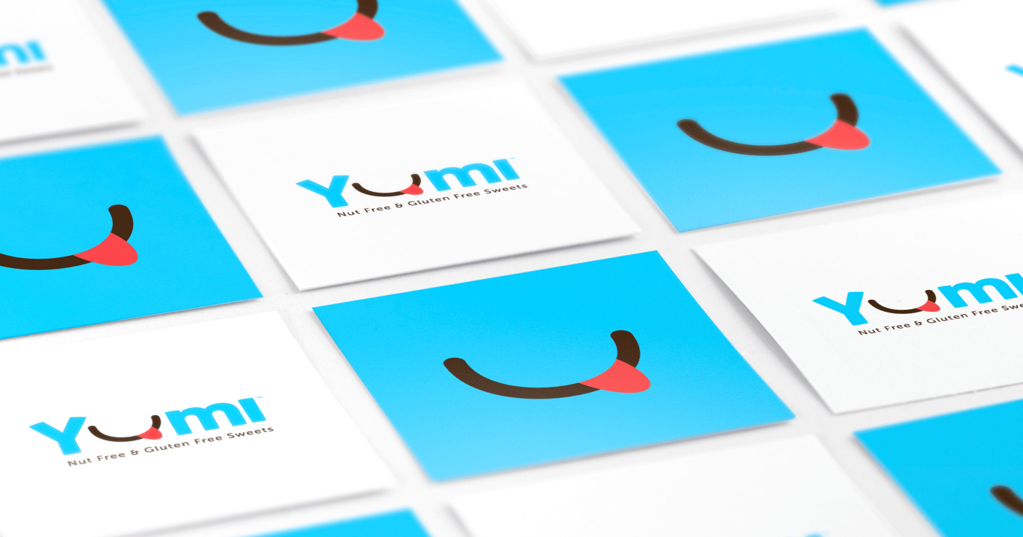
Whenever we create a brand, we like to make sure the brand can work across many mediums, whether it be how it looks on a flag pole or what it looks like a sticky label. We feel that the Yumi logo made up of a bold light-hearted, fun typeface, Mikado We were fortunate that the ‘u’ character in the word Yumi seemed logical to be replaced with smiley mouth shape so we created a lip-smacking mouth icon shape evokes all kinds of fun feelings.
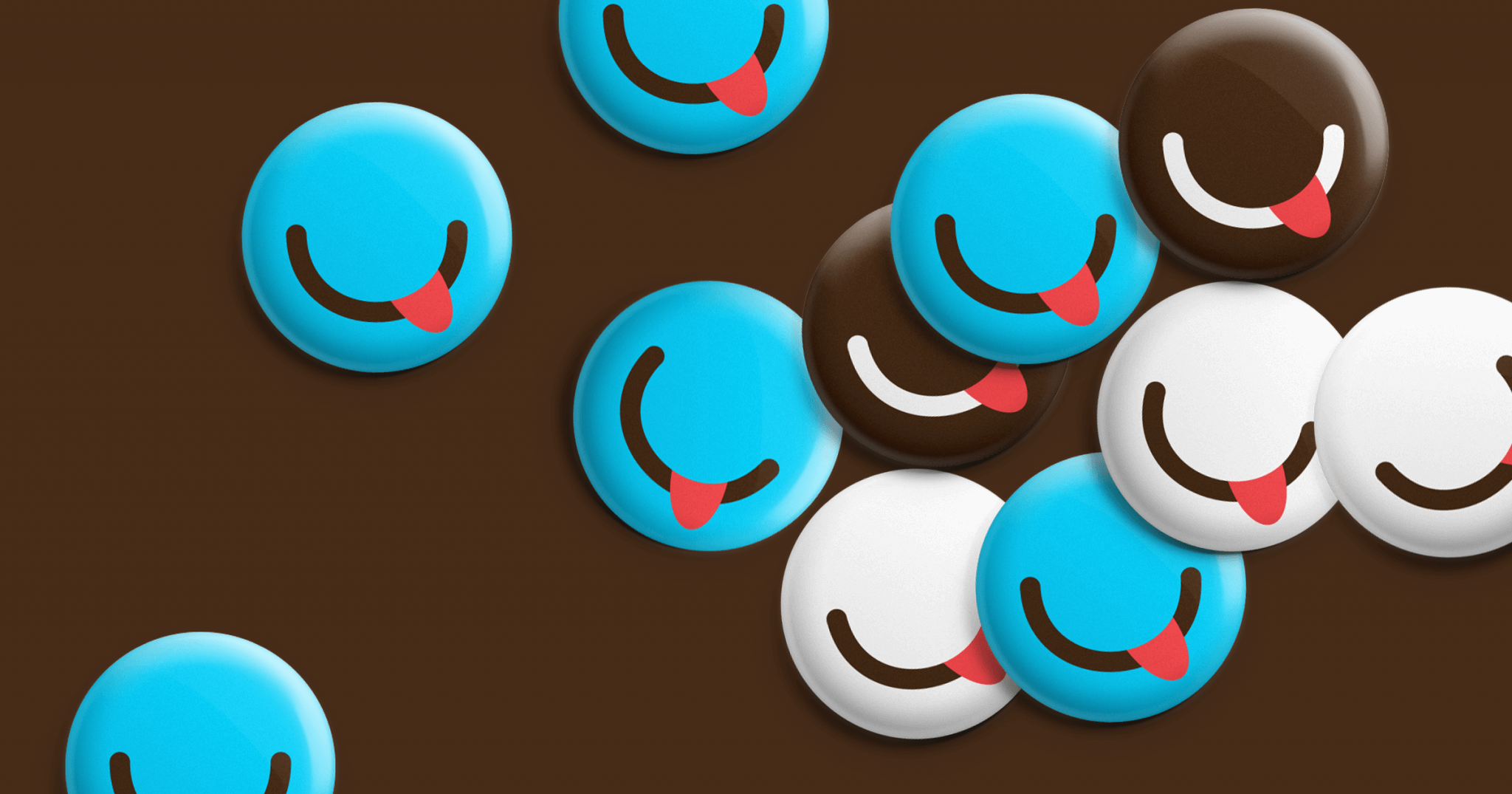
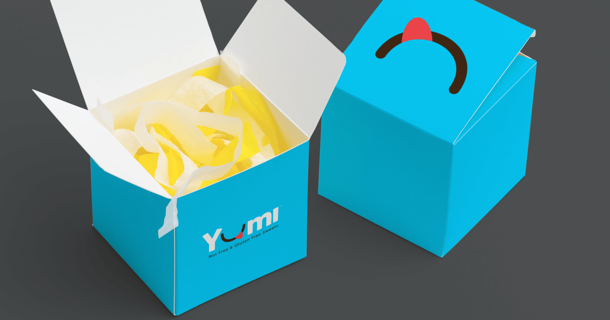
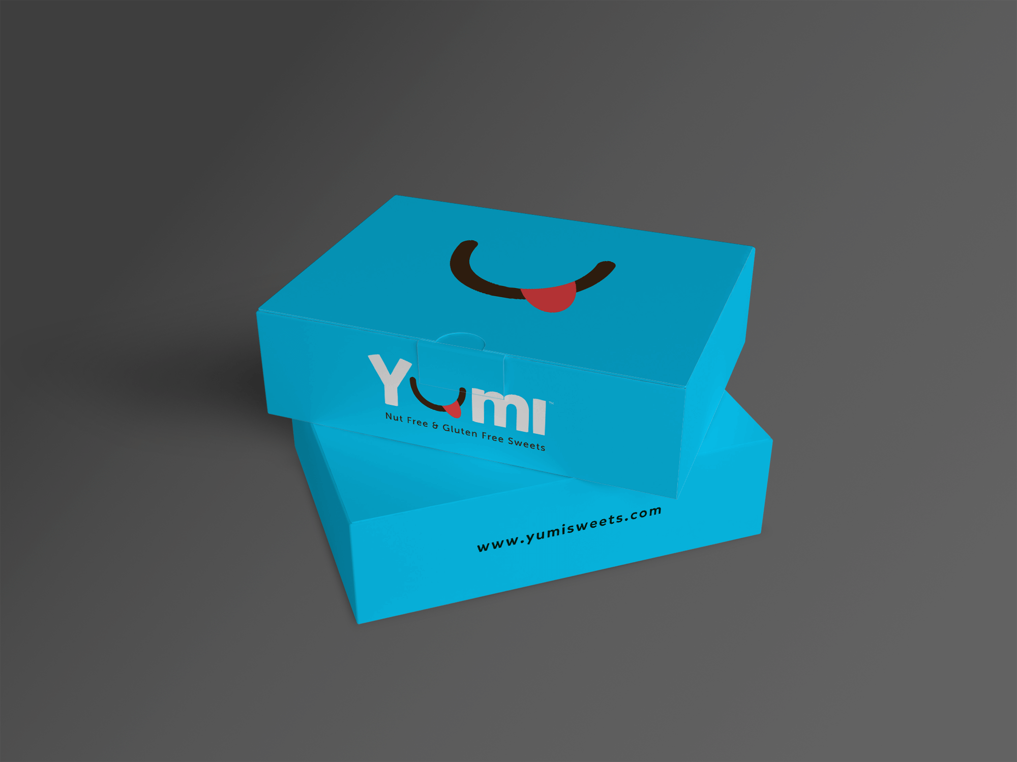
Furthermore, if this mouth shape was isolated from the letters in the logo, we believe that it is still very much iconic and strong. We have demonstrated this in the cute little boxes she had made up as well as the promotional badges and t-shirts. We chose this vibrant colour scheme, steering away from anything too ‘cute’ or too ‘sweet’. Sky blue feels happy and positive, the complimentary chocolate brown adds contrast. Simplicity was the the way forward and we are really happy with the outcome of this brand, equally as happy as she was!
