What they wanted
Your Physio, a Lincolnshire-based startup who specialises in physiotherapy and sports injury invited KidDotCo to create a brand for his fledgling practice. While he trusted us to apply our expertise on creating a robust brand, he was keen to make sure it had the capacity to be scalable, with the view of opening more practices across Britain in the form of a partnership or franchise. The challenge of this brand was to make sure it appealed to both local clientele and could be recognised as larger organisation once Your Physio had established itself.
What we did
- Brand Development
- Corporate Guidelines
- Frontend Development (HTML5/CSS)
- Signage
- Search Engine Optimisation (SEO)
- Social Media Marketing
- Social Media Optimization (SMO)
- Stationery Design
- UX/UI Design

A strong dynamic brand that promotes an active lifestyle
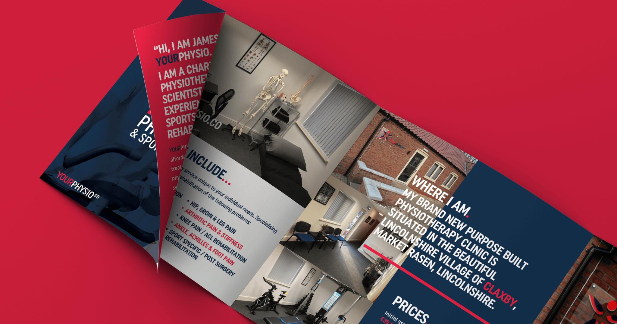
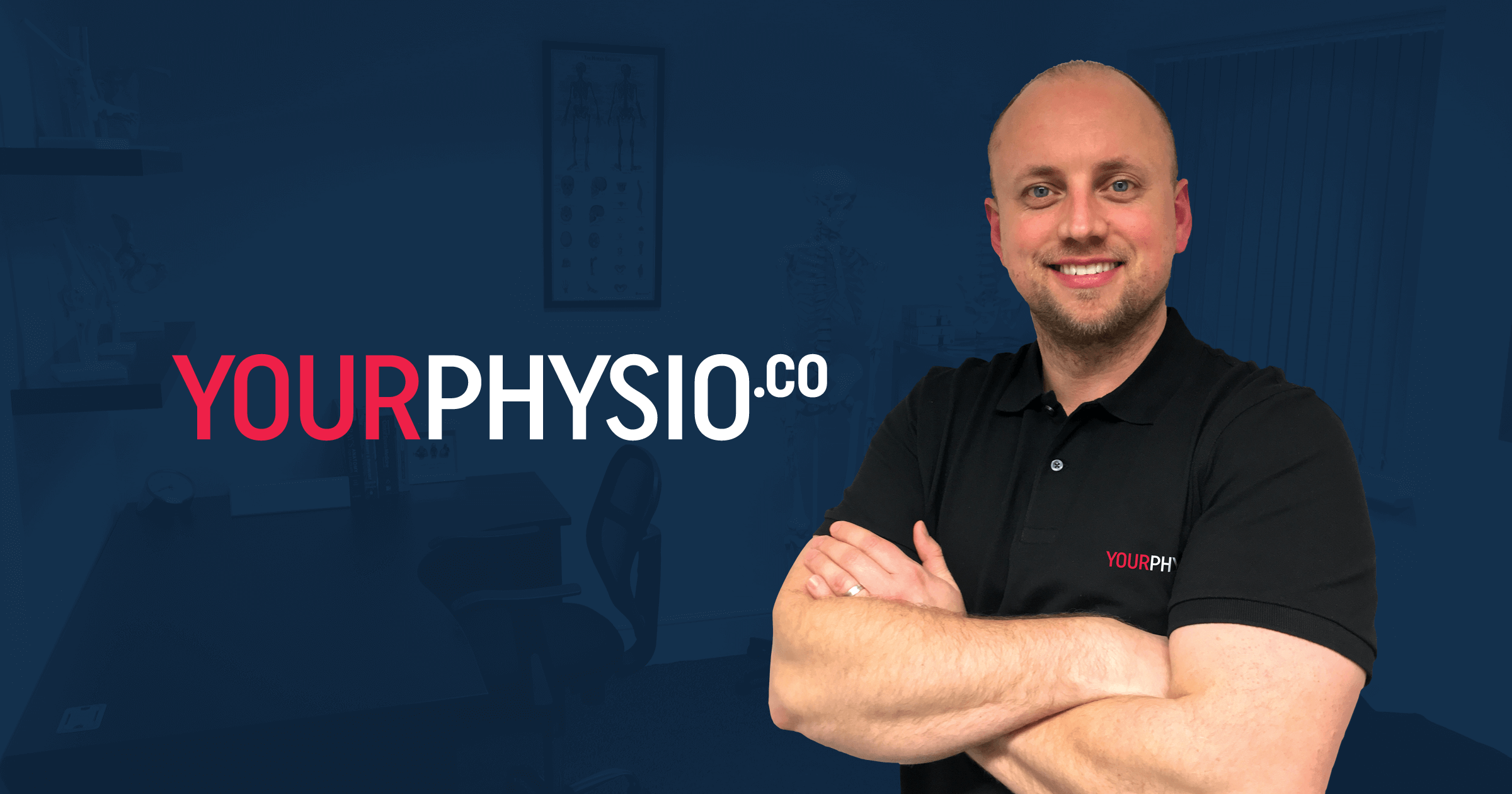
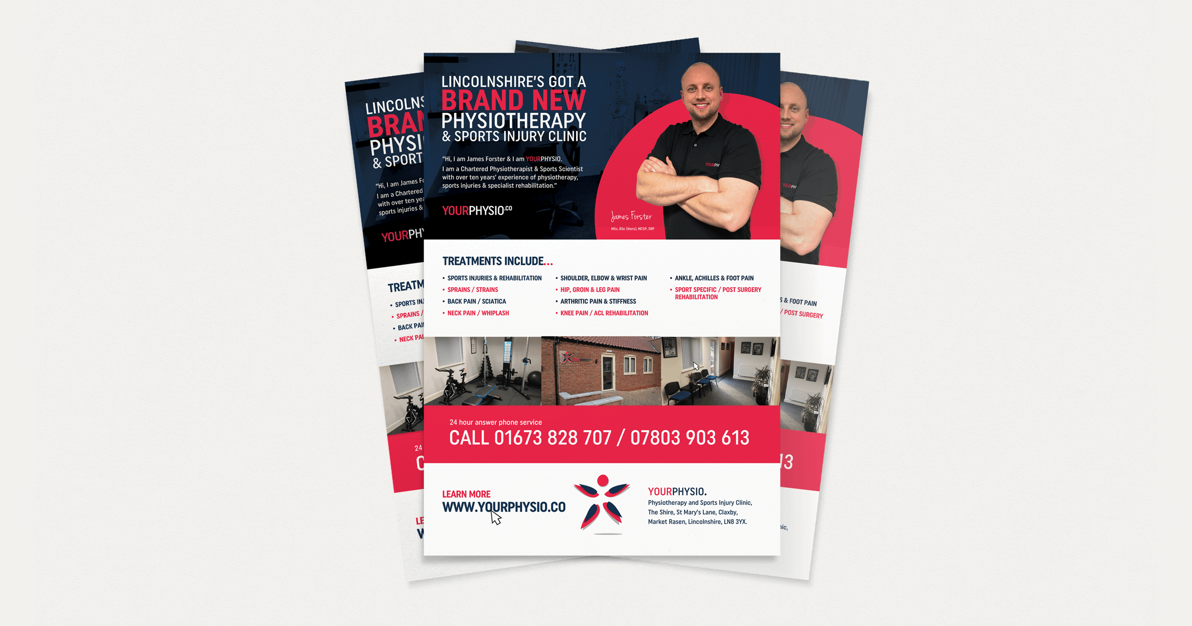
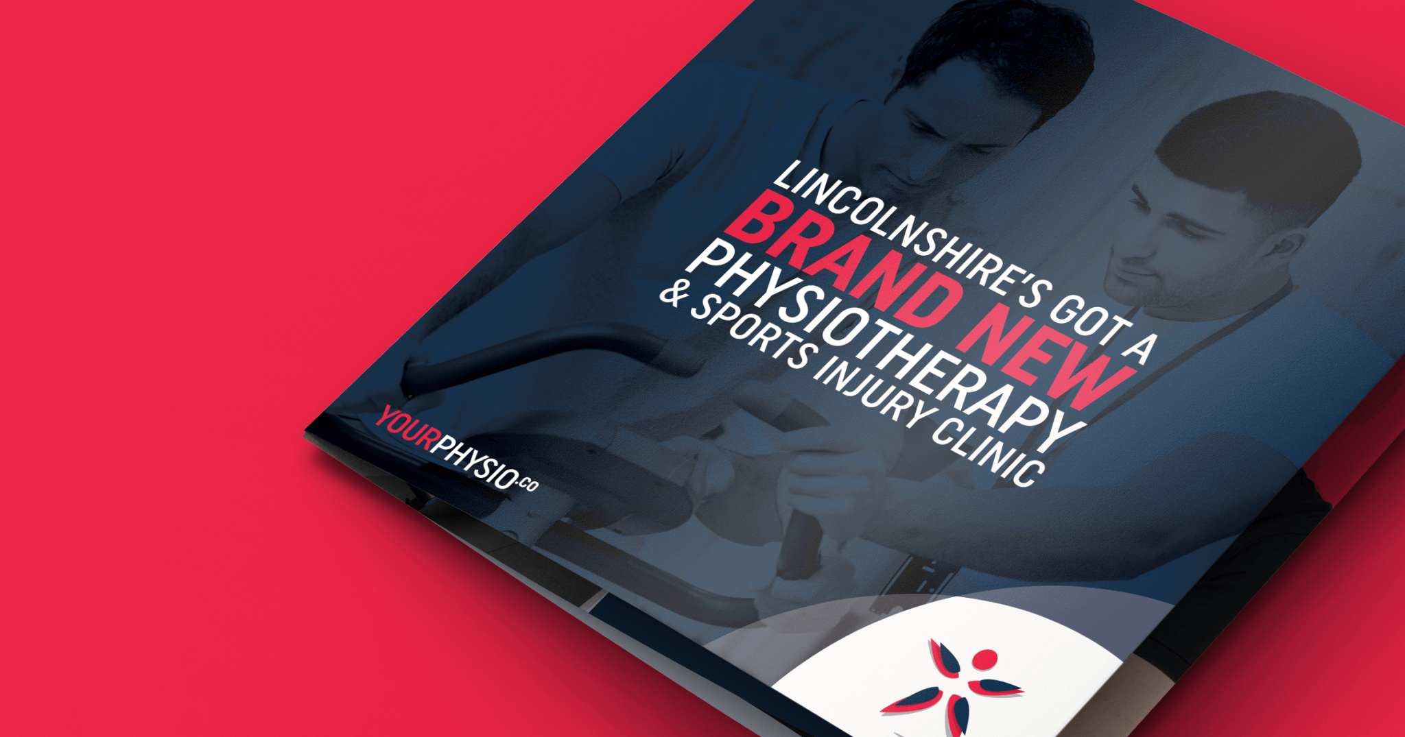
What excited us about being involved with this brand was that we were working off a blank canvas. Working closely with James on what his needs were for the brand. He wanted us to create a strong brand that wasn’t too cliche, avoiding stock photography, so Your Physio‘s purpose built physiotherapy clinic in Claxby, Lincolnshire provided us with great inspiration to build the brand around, making use of the original photography James had commissioned.
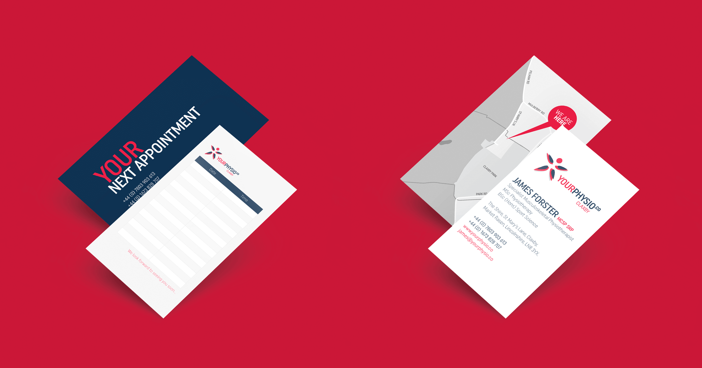
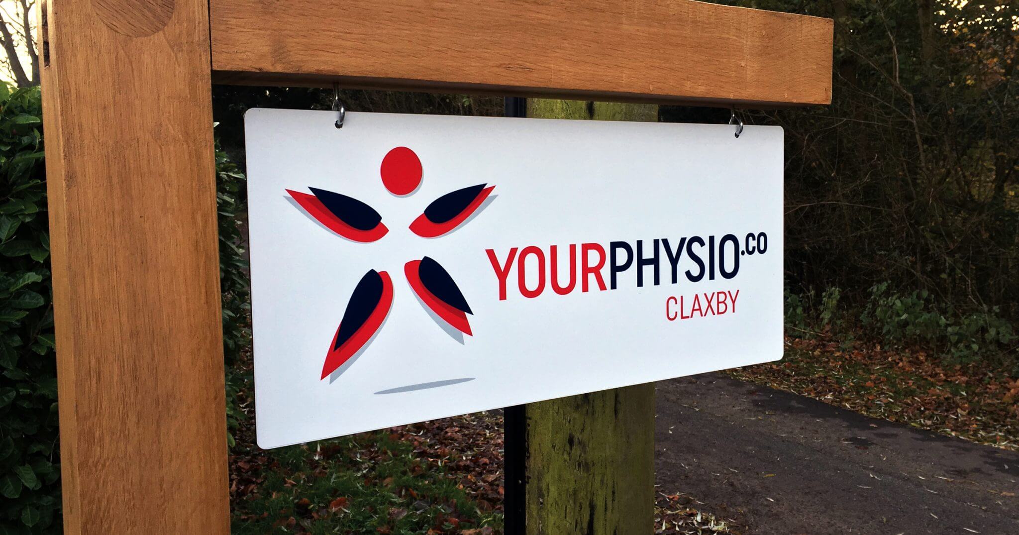
One thing we have learned over the years is that a strong brand should be able to be instantly recognisable and one which can scale seamlessly across a variety of mediums. We felt we could do this by creating a dynamic icon representative of a active person in a star shape position. It feels strong and evokes the feeling of an active lifestyle – something Your Physio are extremely passionate about. Bearing in mind the brand was to be used all the signage for the clinic exterior, we chose a capitalised sans serif font Uniform Condensed which could be easily read from a distance. Additionally we found this font was ideal to use throughout the interior too as James plans to decorate the walls with inspirational quotes.
It was important too to choose a colour palette that was gender neutral, but not clinical, The dark navy in our colour palette provided a base for the vibrant red and white to really stand out in all of our marketing materials. We feel this colour scheme is particularly effective when placed on a white background demonstrated in the signage below.
