
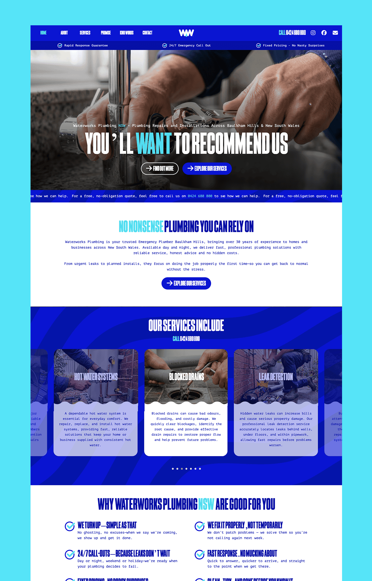
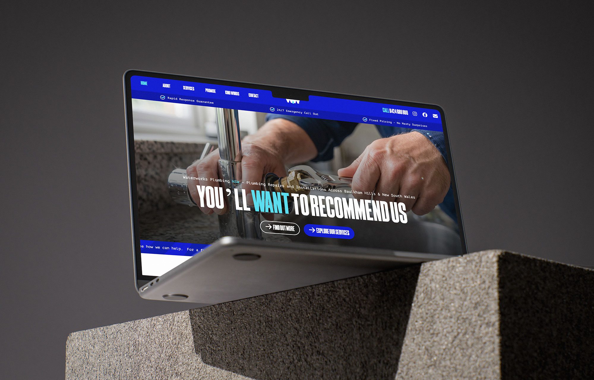
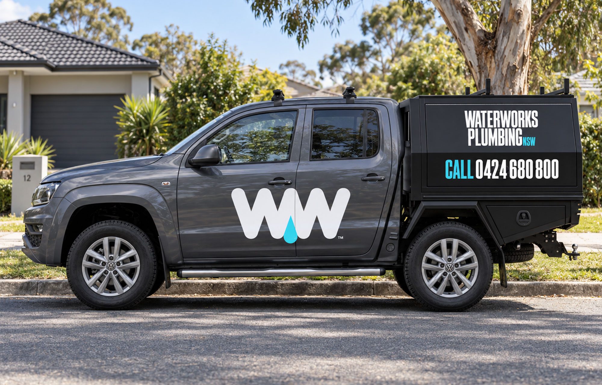

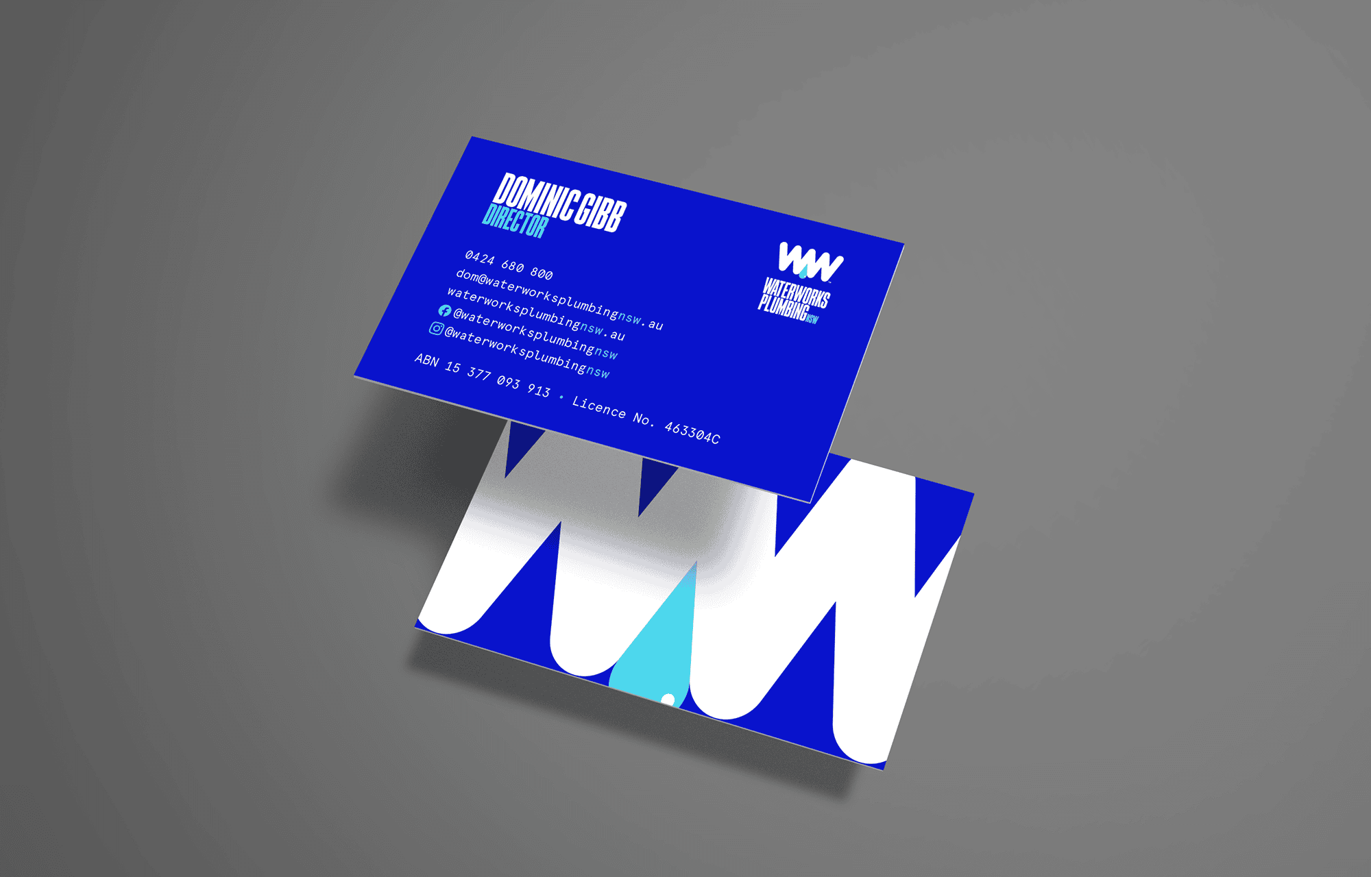

I was approached by Sydney-based start-up Waterworks Plumbing NSW as a full-service client, with the opportunity to create everything from the ground up — brand identity, website and vehicle livery. It was the kind of project I love getting stuck into, and one I took a great deal of pride in producing.
Plumbing brands have a habit of falling into the same visual clichés — taps, pipes, wrenches and plenty of washed out blue. Even some of the most established names in the industry are still working with identities that feel dated or difficult to translate into a modern digital world.
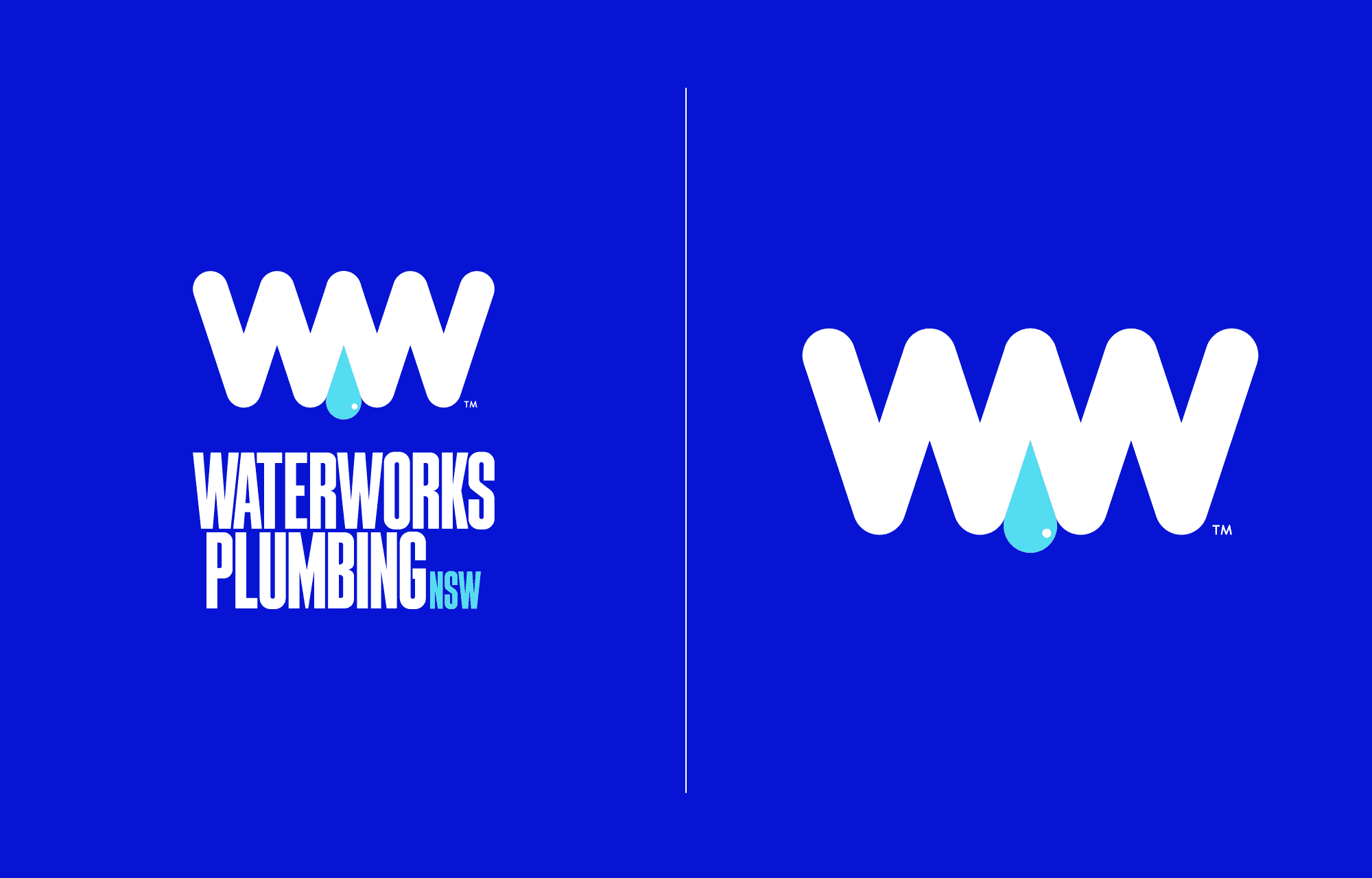
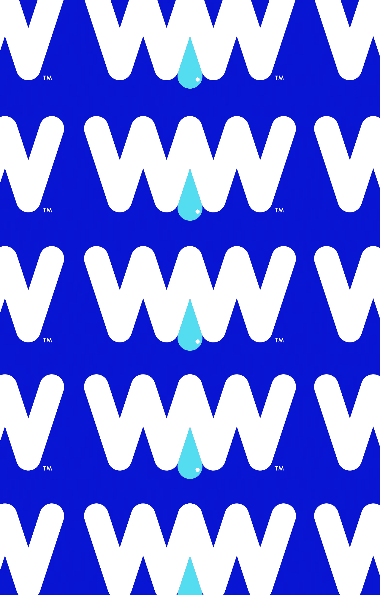
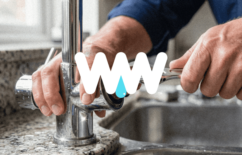
I wanted Waterworks to feel different. The identity is built around a bold, robust icon and wordmark that gives a subtle nod to the industry without screaming “plumber”. More importantly, it was designed to scale — from a tiny favicon on a phone screen to a huge piece of livery on the side of a truck. Waterworks needed to be seen, remembered and recognised, both online and out in the real world.
At the heart of Waterworks is a simple promise: “You’ll want to recommend us.”
We developed the line together because trust is everything in a service business. Before someone has picked up the phone, met the team or seen the quality of their work, the brand has already started that conversation. It needs to look established, capable and dependable from the offset.
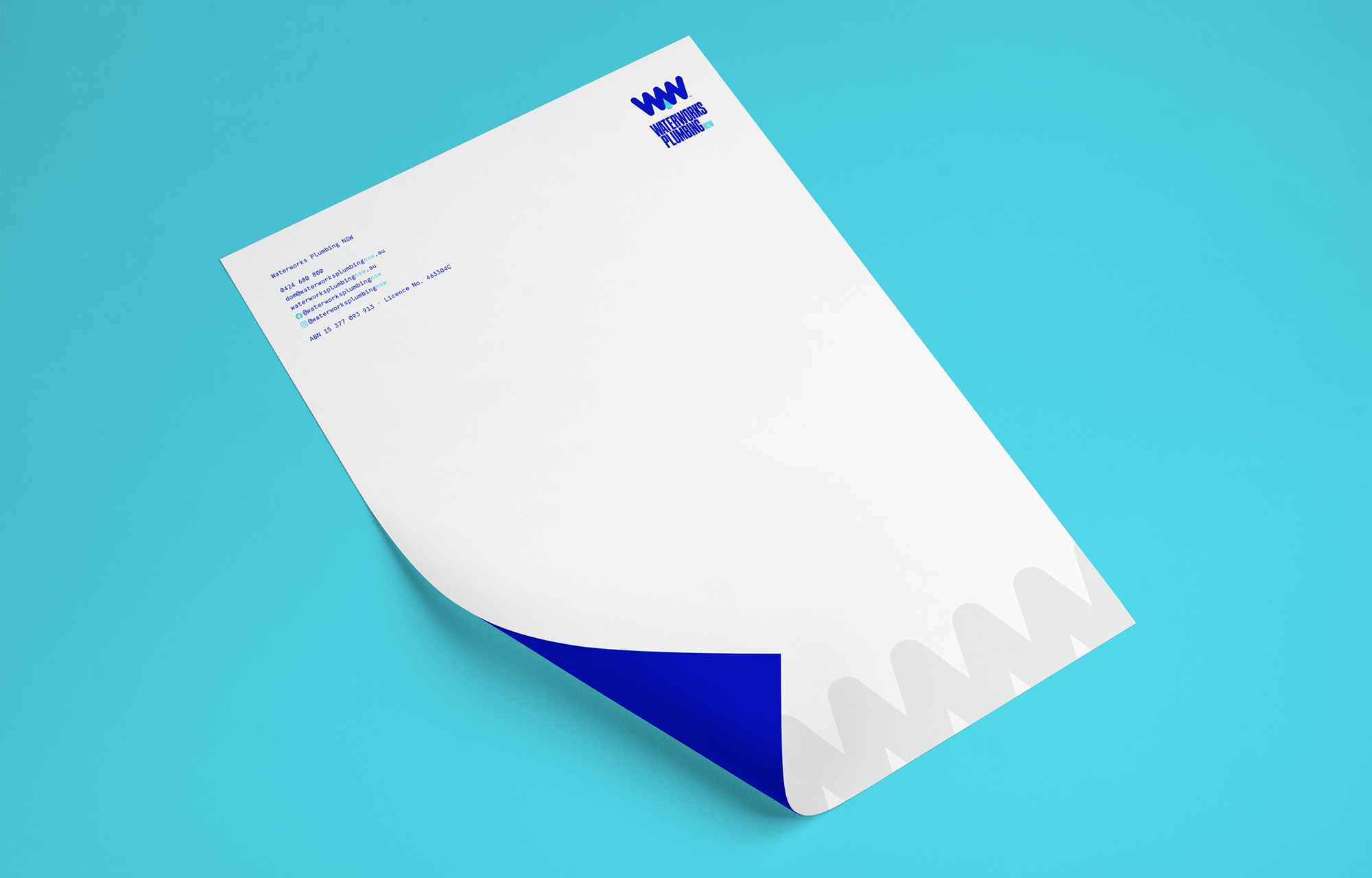
That thinking runs through every part of the identity. Big, bold and deliberately confident, Waterworks has been designed to give the business presence from day one — whether that’s through the website, social media, stationery or a truck pulling up outside someone’s home.
The result is a cohesive brand that feels far bigger than a start-up, while still retaining the straightforward, approachable personality behind the business. Strong enough to stand out today, but flexible enough to grow with Waterworks for years to come.
We have one coming soon, I promise!
 Back to top