Posted 1 week ago
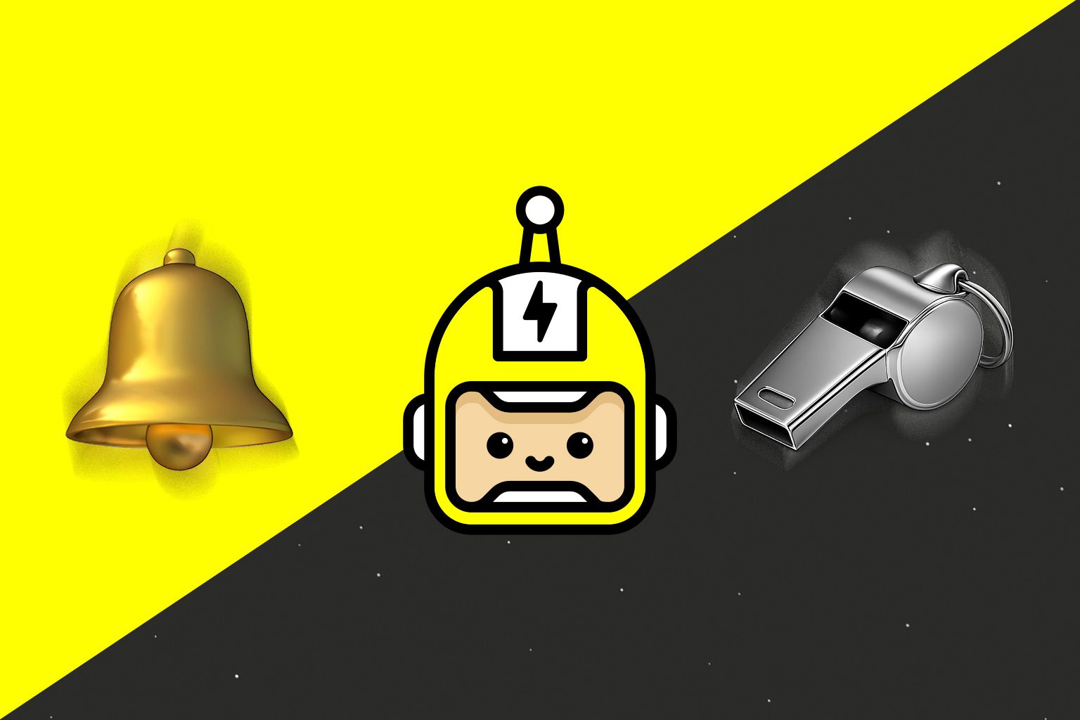
If you read my launch post back in January, you’ll know I adore bells and whistles: subtle animations, playful interactions, all those little moments of delight. I’ve also got zero time for generic design. Those two things go together more than you’d think, so I wanted to stick up for the tiny stuff for a minute.
Micro-interactions are the small ways a website or app answers you back. A button that presses in, a menu that slides rather than snaps, a form field that gives a gentle little shake when something’s not quite right. It’s tempting to file them under “decoration” and cut them when the deadline looms… but I think good ones do proper work. They tell you something actually happened, so you don’t tap three more times and order four of everything. They give a brand its personality, because the way something moves says as much as the colours or the typeface. And they build trust: when the little things are right, people assume the big things are too.
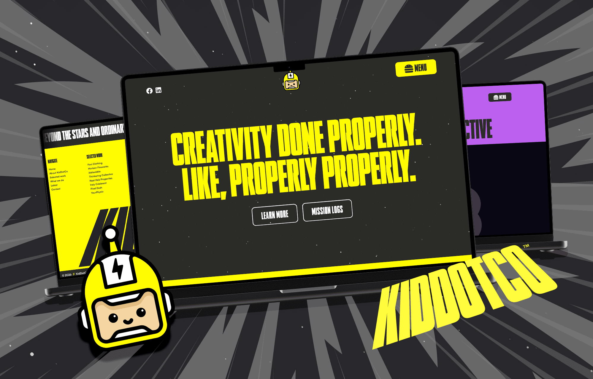
When Mike and I rebuilt kidd.co this year, I wanted to go full tilt. Bootstrap, WordPress and a sprinkle of GSAP magic, all to make it cute, curious and a bit cheeky. I’m particular about load times, too. People don’t have time to hang around. With the site already quite nippy, I felt there was room for a bell and whistle of our own: a page loader and wipe transitions to make moving between pages feel even slicker. I like how deliberate and neat they make the whole experience feel.
I wanted a little detail on the ‘work’ pages too, which you can see on Thinkering Collective. I’m proud of the brands Mike and I create, so giving each brand’s colour a proper presence on the page felt right. Then, as you scroll, the page heading shrinks and the colour switches to yellow — our brand colour. Did it need to do that? Probably not. Did I want it to? Absolutely.
Of course, chances are nobody notices the hours that go into it. They just notice it feels nice, and have a proper poke around. I’ll happily take that.
Fun is great, mind. Fun that breaks things isn’t. I want every animation to earn its place. If all it does is show off and gets in the way, it probably needs to go. I also want people who prefer less motion to feel comfortable, so when someone’s device asks for reduced motion, the big swooshes calm down to gentle fades or switch off altogether. I don’t want anyone left waiting for a lovely transition to finish, either. The same goes for keeping things lean: a tiny hover effect shouldn’t need a giant library. Where plain CSS does the job, CSS does the job. Testing on actual phones matters too. Something that glides on a big desktop screen can feel like treacle on an older handset. Some blur effects proved particularly demanding on iPhones, so I worked with Mike to tone things down where needed.
This is where having Mike as my brother really helps. I think in feeling and personality: what should this moment say? Mike thinks about how it actually behaves: timing, easing, and what happens when someone double-taps it on a dodgy connection. He originally wanted to be an illustrator, so he cares about the motion as much as the maths. I sketch it, he builds it, I nudge it, he tweaks it, and round we go until it clicks. It’s not always tidy, but it works. I get attached to projects I’ve nurtured from the beginning, especially something like Ibbleobble. Thankfully, Mike has always been good at keeping me in check when I go full-blown creative!
For me, the gap between a good product and a great one usually comes down to thoughtful execution. Bells and whistles, done properly, aren’t extras. They’re how people know you cared.
So go on, have a poke around our selected work and see how many little wiggles you can spot. If you’ve got a favourite tiny interaction somewhere on the web, I’d love to see it. And if you fancy something that feels as good as it looks, give me a shout.
Here’s to the little things… and making them bounce. Just maybe a bit less.
Bye for now, Paul 🤖
 Back to top